


Navigation Rail in Flutter
It’s like a navigation drawer and bottom navigation bar had a cool, modern cousin who’s all about efficiency and style.

Hey there, Flutter enthusiasts! 👋
Let’s talk about something super useful for your apps, especially when designing for larger screens like tablets and desktops – the Navigation Rail. It’s like a navigation drawer and bottom navigation bar had a cool, modern cousin who’s all about efficiency and style. 😎
What is Navigation Rail?
Think of the Navigation Rail as a vertical sidebar for navigating your app. It’s always visible on larger screens, making it easy for users to jump between sections. Unlike a drawer (which you have to open) or a bottom bar (that might feel out of place on a big screen), the Navigation Rail is sleek, functional, and always within reach. 🚀
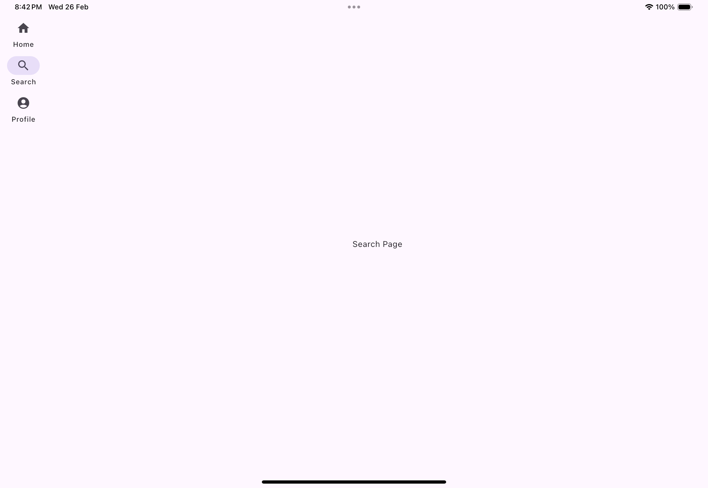

The Navigation rail can be replaced by drawer on phones, explicitly.
Why Should You Care About Navigation Rail?
Here’s why the Navigation Rail deserves a spot in your app:
Made for Large Screens: It’s perfect for tablets, desktops, and foldable devices, where space isn’t an issue.
Always Visible: No more extra taps or swipes – the navigation is right there, ready when you need it.
Supports Multiple Sections: Whether you have three or ten destinations, it keeps everything neat and organized.
Customizable: Want it to match your app’s vibe? You can tweak the colors, icons, labels, and more.
Responsive Design: It adapts to various screen sizes, so you can build apps that look great everywhere. 🌟
How Does Navigation Rail Work?
The Navigation Rail is pretty easy to set up. It lives inside a Scaffold and usually pairs with a Row to create a layout where the rail sits on one side and your main content takes up the rest.
Key Ingredients:
NavigationRail: This is your main widget.NavigationRailDestination: Each destination has an icon and an optional label.selectedIndex: Tracks which destination is currently active.onDestinationSelected: Updates the active destination when a user clicks on it.
Let’s See Some Code!
Here’s a quick example to get you started:

Making It Your Own
You can customize the Navigation Rail to fit your app’s personality. Here’s how:
Change Colors: Use the
backgroundColorproperty to make it blend with your theme.Style Labels: Adjust the
selectedLabelTextStyleandunselectedLabelTextStylefor a unique look.Tweak Icons: Modify the
selectedIconThemeandunselectedIconThemeto match your design.Add Extra Actions: Want a settings button at the bottom? Use the
leadingortrailingproperties.Align Items: Use
groupAlignmentto control the vertical alignment of items in the rail.
When Should You Use Navigation Rail?
Here are a few scenarios where the Navigation Rail shines:
Tablet and Desktop Apps: Make the most of the extra space.
Apps with Multiple Sections: Keep navigation simple and accessible.
Responsive Designs: Pair it with a bottom navigation bar for smaller screens.
Wrapping Up
The Navigation Rail is an awesome tool to have in your Flutter toolkit. It’s easy to set up, customizable, and perfect for creating polished, professional apps for larger screens.
So, what do you think? Ready to give the Navigation Rail a try? Let me know how you plan to use it in your next project! 🚀